Creating Forms
How to create custom forms in CommonSpot
Prerequisites
This tutorial assumes you are familiar with the following:
Overview
Forms can be used to get information emailed to you from website users.
Before creating a form, make a list of the essential information you would like to receive. Try to make the form as short as possible, and keep the multiple-choice questions to a minimum. People are less likely to fill out long forms.
Related reading:
Setting Up the Form
- Navigate to the page you would like to put the form on.
- Go to Author or Edit mode.
- Insert the Simple Form element (in the Miscellaneous category).
- Click to define the Simple Form Element
- Select "Create new simple form"
- Name the form (letters and numbers only, no spaces or special characters).
- Provide one or more email addresses, separated by commas, that the form data will be sent to.
- Sender's email address checkbox: If this is checked and a user is logged in to the website, the email will look like it was sent from that person. Otherwise, it uses the anonymous email address below.
- Anonymous sender's email address: This is what the "From" field will be in the emails sent by this from. The web team usually uses 'cinweb@stlouis-mo.gov.'
- Form action: After the user submits a form, you can either display some custom text (the first option), or you can send them to another page (the second option).
- Press "Save."
This will bring you back to your page, and the form element will still be blank, like in the image below.

Field Basics
You have set up the basics for the form, but now you need to add some form fields for people to fill out.
- Click on the yellow box with the plus sign to edit the element, then click on "Edit fields."
- This brings you to the form's list of fields. Click "Add new field."
- Select a field type from the drop-down box.
Each field has a:
- Name: No special characters or spaces (users won't see this).
- Label: Short descriptive text to the left of the field.
- Description (optional): Just in case the field needs extra explaining. Shows up below the field.
- Required: Yes/No. If you select "Yes" then people will be forced to fill it out before submitting the form.
- Default value (optional): A value that shows up in the field by default. This is under the "Other Properties" tab.
Once you are done, click the "Create" button.
Add as many fields as you need, then press "Close." When you are satisfied with your form, submit the element to be published, then go through and submit the form to test it out.
Common Field Types
Text-Related Fields
Text: Used to collect short bits of text. The label for this field is bold, indicating that it's required.![]()
Small Text Area: For collecting longer bits of text, it's nice to give people more room to type.

Large Text Area: A bit bigger than the Small Text Area.

Email: Looks like a text field, but checks to make sure they entered a proper email address.
![]()
Date: Again, looks like a text field, but it forces the user to enter a date in the format MM/DD/YY.
![]()
Number (float) and Number (integer): Floats allow decimals, like 5.234, and integers just allow whole numbers (no decimals).
![]()
Choice-Related Fields
Check Boxes: Use these for yes/no answer questions.

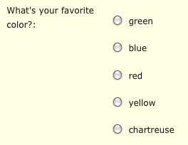
Radio Buttons: For multiple-choice questions (limit one answer).

Selection List: For multiple-choice questions (can be set to allow multiple answers).

Help Us Improve This Page
Did you notice an error? Is there information that you expected to find on this page, but didn't? Let us know below, and we'll work on it.
Feedback is anonymous.